29 April
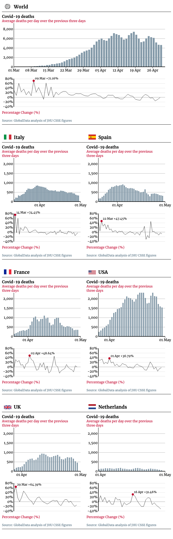
Two things are clear from our latest charts plotting the rise and fall of Covid-19 deaths across the world.
Go deeper with GlobalData

Discover B2B Marketing That Performs
Combine business intelligence and editorial excellence to reach engaged professionals across 36 leading media platforms.
The first is that countries like Italy and Spain are in a different phase of virus control to the UK and, in particular, the US.
Italy has been showing a stable decline in daily deaths for more than a month; Spain, for nearly a month. Deaths in the UK are also in decline, even if the figures have been more erratic.
More data is needed before we can say the same about the US with absolutely certainty.
The second is that the path down from the peak is a long and slow one.
Our chart looks at a three-day rolling average of daily death counts to smooth out “noise” caused by unusually low or high reporting on individual days. At the peak of its Covid-19 outbreak, Italy recorded an average of 855 deaths in the three days to 30 March.
A month on and that three-day average still stands at 325. Or to put it in more stark terms: up to 30 March, 11,591 people had died from Covid-19.
Since then there have been 15,768 more deaths in Italy, and we are not yet two-thirds of the way down from the peak.
Many more deaths will, sadly, follow; other countries can expect to tread a similarly grim path.
Covid-19 daily death totals: plotting the path down
While every nation is giving regular updates on deaths linked to the virus, it can be difficult to interpret this data.
Daily death totals are volatile and can fluctuate rapidly from day to day; countries can change the time they report, or their methodology, leading to sudden and abrupt change.
In the charts below we smooth out the data by using a rolling three-day average of deaths. Each day is plotted against the average number of new deaths reported over the previous three days. The percentage increases (or decreases) are plotted separately.
The charts cover the countries with the highest number of deaths overall, excluding China – where daily confirm deaths have slowed to a trickle – and Iran, where the data may not be reliable.
The charts start at the point each country passed 1,000 Covid-19 deaths in total.